| How it works |
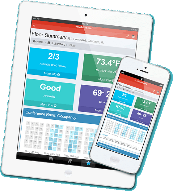
| A real-time dashboard, as well as data analysis using PowerBI and Tableau, allows us to “slice and dice” sensory data in different ways to gain new perspectives on occupancy. |
|
| Our goal is superior data collection and analysis to help our clients operate even more effectively. This system will integrate with our client’s existing equipment, or they may install new sensors. We will happily refer our clients to companies that will perform the installation process. |
|
| Real-time, robust, and historic data is stored on the cloud in a data lake. Big data analytics correlate sensor data with Office 365 Calendar schedules, regional weather (including storm tracking), social media, time of day, air quality, and other public data to create rich, multi-dimensional reports. |
|
| The result? An intelligent, fully-meshed, highly-efficient workspace. |
|
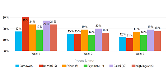
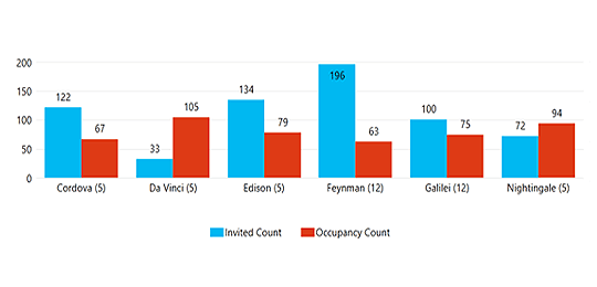
| Examples of historic data and real-time data: |
 |
|
| Monthly Conference Room Occupancy |
|
 |
|
| Real-Time Meeting Attendance |
|
|
|
|
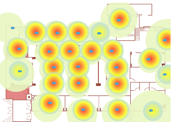
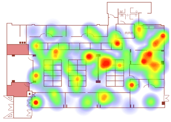
| With different kinds of heatmap reports, now we are able to analyze traffic patterns and people concentration in specific areas. |
|
 |
|
| Heatmap showing traffic patterns |
|
 |
|
| Heatmap showing concentrations of people |
|
|
|
|